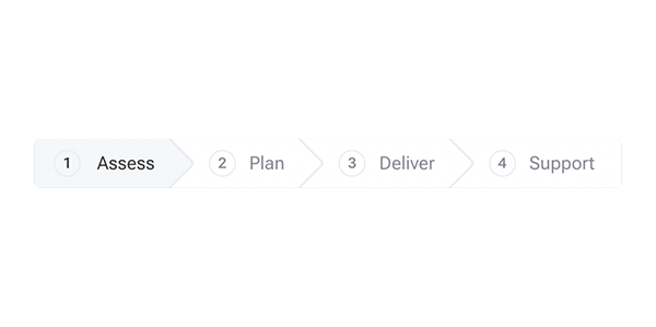
Tabs
Ceates tabs that can be cycled through automatically, with an optional change the speed, and pauses with mouseover.
Default Tabs
First tab content
Second tab content
Third tab content
Fourth tab content
Fifth tab content
Vertical Tabs
First tab
Second tab has a custom label
Third tab
Fourth tab
Style Example 1
First tab
Second tab
Third tab
Notes on usage
- Each
.columnmust have a unique ID. - The initial header serves as the button text and can be replaced by adding
data-column-header='Example'to the.column.
-
div
-
ul.wckd-tabs-nav
- li
- button
- span.progress-bar
- li
-
div.columns.wckd-tabs
- div.column#id
-
ul.wckd-tabs-nav
