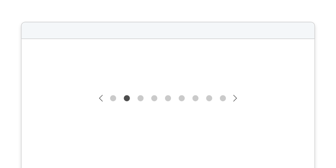
Accordion
Easily expand and collapse content by turning your Grid Columns into an accordion using wckd-accordion, accordion-toggle and accordion-content. Customize with optional features such as an expand-all button and a search filter for added functionality.
Basic example
Here's some content!
Here's some content!
Here's some content!
Notes on usage
Installation
See Get Started
Options
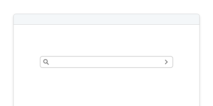
Data attributes that you can use to conditionally apply different stylesdata-show-filter="false"- Remove the search filter
data-show-expand-all="false"- Remove the expand all button
HTML Structure
-
div.wckd-accordion-utility
Container for utility elements related to the WCKD Accordion.
- button.expand-all.text Button to expand all accordion sections. Includes a text label.
-
form.search-filter-form
Form element for the search filter functionality.
- input.wckd-filterInput field for the search filter.
- label.wckd-filter-labelLabel associated with the search filter input field.
-
.columns.wckd-accordion
Container for grid columns transformed into the WCKD Accordion.
-
.column
Individual column within the accordion.
- button.accordion-toggleButton to toggle the visibility of accordion content within a column.
- div.accordion-contentContainer for the content within an accordion section.
-
.column
Individual column within the accordion.
Known bugs
- The
.wckd-accordion-utilitycontainer shouldn't show when empty - Search filter leaves behind empty
marktags that are used to highlight characters - Search filter doesn't activate the "expand/collapse all" button
- Search filter issue when nesting columns in
.accordion-content
